Refreshing Visuals to Solve Brand Disconnect


ROLE
Brand Designer
ROLE
Brand Designer
TIMELINE
6 Weeks
TIMELINE
6 Weeks
SKILLS
Visual Design, Communications, Wireframing
SKILLS
Visual Design, Communications, Wireframing
TOOLS
Figma, Adobe Illustrator, Adobe Photoshop, Adobe Express
TOOLS
Figma, Adobe Illustrator, Adobe Photoshop, Adobe Express
context:
context:
Camp Swamp is a non-profit organization that provides camp and retreat services in Georgia for kids ages 9-18. The organization runs 7 weeks of overnight camp during the summer and rents out their facilities to schools, churches, universities, and any sports or business groups during the year.
As a Media Relations Intern, I built a stronger digital presence by producing multimedia content and social campaigns, refreshing the brand’s visual identity, creating guidelines for consistency, and designing website layouts in WordPress and Figma to improve navigation and storytelling for new families.

results:
results:
✹ 43% boost in online website and social media engagement.
✹ Developed a brand identity system with new colors, logos, typography, and guidelines.
✹ Designed and prototyped website layouts in Wordpress to optimize user navigation and information hierarchy.
✹ Learned how to lead and manage a rotational team, coordinating daily responsibilities including photography, videography, social media, documenting, and content creation for 7 weeks.
the process ↓
the process ↓
how might we create a consistent identity that reflects the organization’s core values while making it easier for new families to recognize and trust the brand ?
how might we create a consistent identity that reflects the organization’s core values while making it easier for new families to recognize and trust the brand ?
the goal:
the goal:
This project would be successful if multimedia content and consistent visual identity boost online engagement and make Camp Swamp’s mission more visible.
The goal was to create a refreshed visual identity that aligned with their mission — one that clarified their voice & image, resonated with their audience, and improved user engagement on social media.
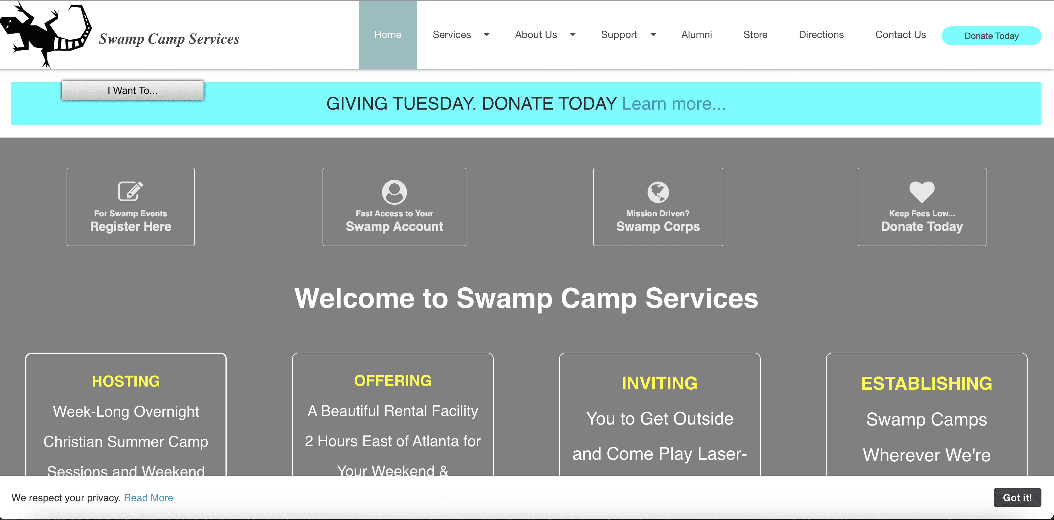
↑ previous website
↑ previous website
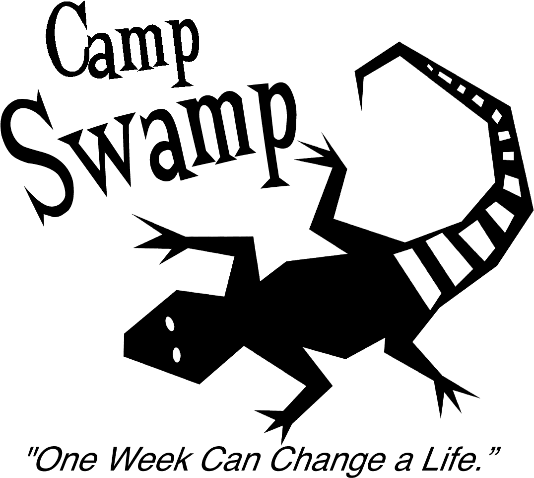

← previous logo + social media
↑ previous logo + social media
current state:
current state:
When I started this project, Camp Swamp did not have a clear visual identity, target audience, or specific brand standards.
Camp Swamp had some verbal identity established through core values, a mission, and a general process, but was missing a visual connection. Trusting and recognizing the camp was easy for previous campers and parents, but it was difficult for new families to find.

constructing identity:
constructing identity:
I conducted 4 interviews and asked questions to help the directors, head of marketing, and executive director narrow down the purpose, mission, and emotional core behind what Camp Swamp represents.
In creating the brand guidelines, we had 3 key goals:
Narrow down a clear target audience.
Develop clear verbal guidelines that flow from the mission and core values of camp.
Create consistent visuals across all channels with colors, typography, and a logo.

the audience:
the audience:
When considering who attends Camp Swamp, we realized that while the camper is at the center of the experience, the decision to send them lies with their parent.
Through discussion, we identified the “camper mom” as the primary audience—the person who seeks a safe, trustworthy, and values-driven environment for her child.
This perspective shifted our focus: communicate both the joy and belonging of the camper experience, and the trust and reassurance that parents need to feel confident in choosing Camp Swamp.
verbal guidelines:
verbal guidelines:
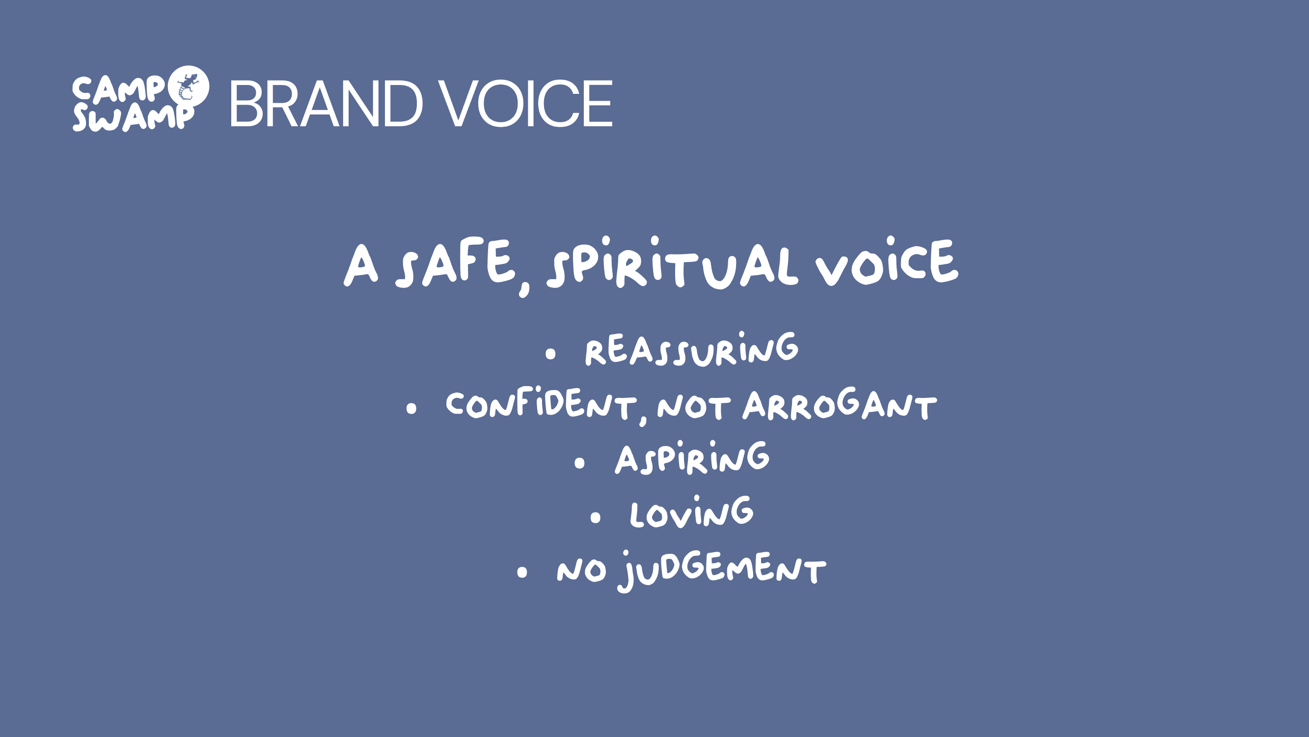
The majority of the verbal guidelines came directly from the leader's answers to the identity questions. Their responses about the camp’s purpose, values, and emotional core highlighted recurring themes of family, trust, and belonging.
With these, we shaped a set of verbal standards that captured Camp Swamp’s voice: warm, welcoming, and rooted in community. These guidelines ensured that every message, from social posts to website copy, consistently reflected the heart of the camp.
visuals:
visuals:
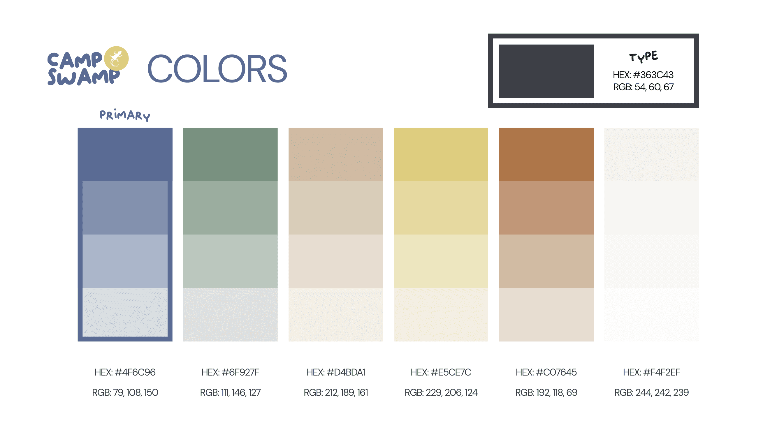
The visual identity was built to reflect both the spirit of play and the grounded trustworthiness of Camp Swamp.
For typography, we chose typefaces that feel playful yet approachable, echoing the camp’s energy without losing readability.
The color palette drew inspiration from the earthy tones of the campgrounds—greens, browns, and natural hues that connect the brand to its physical environment.
Finally, we refreshed the logo by modernizing the original gecko, framing it like a stamp of approval. This gave the mark a sense of heritage and trust while positioning it as a recognizable seal of the camp experience.

visuals:
visuals:
The visual identity was built to reflect both the spirit of play and the grounded trustworthiness of Camp Swamp.
For typography, we chose typefaces that feel playful yet approachable, echoing the camp’s energy without losing readability.
The color palette drew inspiration from the earthy tones of the campgrounds—greens, browns, and natural hues that connect the brand to its physical environment.
Finally, we refreshed the logo by modernizing the original gecko, framing it like a stamp of approval. This gave the mark a sense of heritage and trust while positioning it as a recognizable seal of the camp experience.
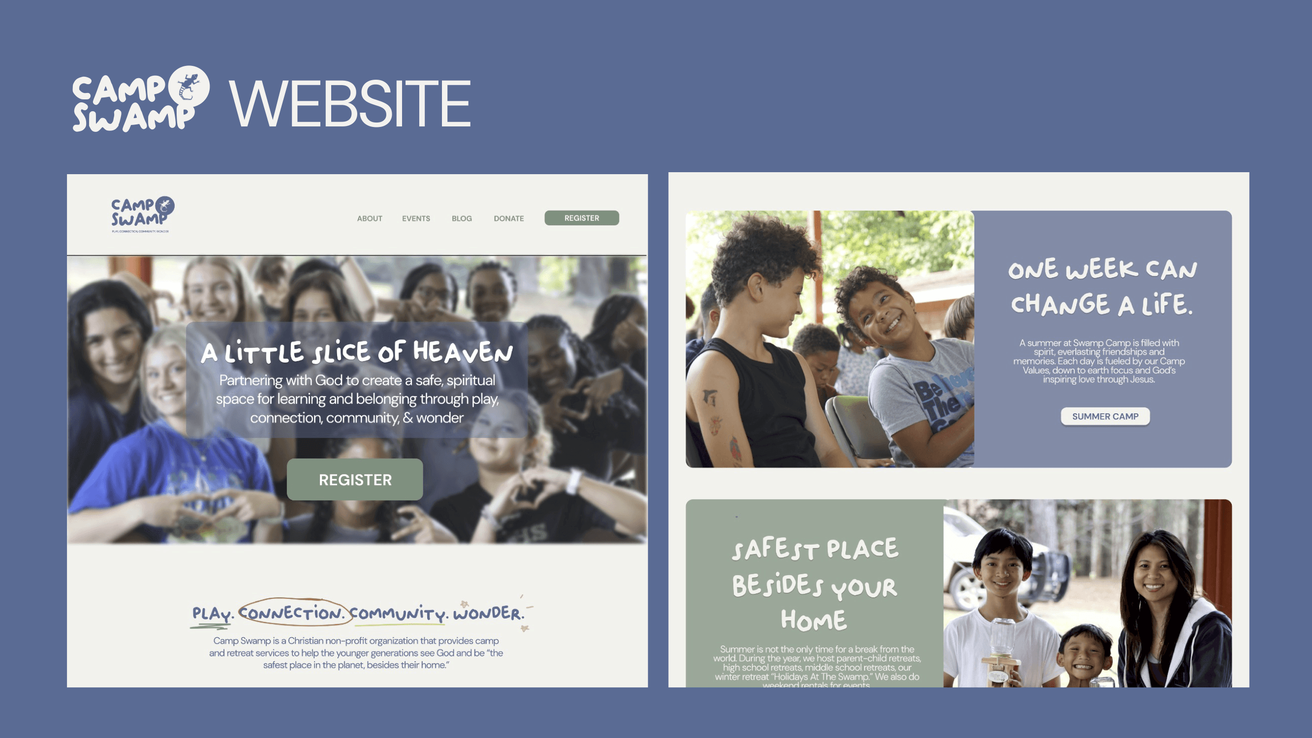
redesigning the website:
redesigning the website:
The website was redesigned to serve as Camp Swamp’s welcoming front door.
The navigation now guides parents quickly to what matters most: safety, values, and registration details. Visual updates brought consistency across channels, while testimonials and photography highlighted the camper’s experience.
The result was a site that not only functioned smoothly but also built trust, making new families feel confident and connected before ever setting foot on campgrounds.
social media:
social media:
We introduced templates for posts, updated color palettes and typography, and wove in the refreshed gecko logo for recognizability.
As part of the social refresh, we introduced YouTube as a new platform to tell Camp Swamp’s story in a more dynamic way. Content shifted toward capturing real camper experiences—photos, quotes, and short narratives—that highlighted the camp’s sense of joy and belonging.

learnings:
learnings:
I taught myself how to wireframe in a nontraditional way—figuring it out as I went and practicing design skills along the way. Looking back, I’d approach the process very differently now (and use different software), but it gave me the chance to grow quickly and adapt.
This project taught me valuable lessons about working with small organizations that have limited resources. I saw firsthand how much visuals matter in shaping identity and building trust, especially for new families.
When I was on-site, I learned what it takes to lead: delegating tasks, coordinating with directors and staff, and guiding the process from research to execution. These experiences not only strengthened my design skills but also showed me how communication and leadership are just as important as the final deliverables.
Like what you see?
Or just want to talk?
I really love new coffee shops + rich conversation!
Like what you see?
Or just want to talk?
I really love new coffee shops + rich conversation!